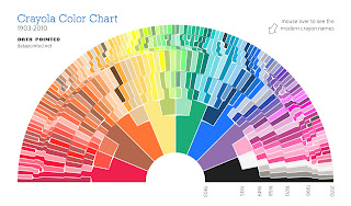
Whether or not you study information science, it's clear to see that information is what controls our current lifestyle. Never before have we had access to some much at our fingertips. As I and countless others have mentioned before, information overload is an inevitable result of this boon. People want well organized information and as much of it as possible. Consolidation and Organization are in! Behold a world of databases, social tagging, and twitter! As much information, as organized and as easy to understand as possible!..thus the INFOGRAPHIC!
The infographic allow us to tame the dissonant information chaos around us and make POINT without shouting! . . . (imagine that)But don't take my word for it. Let's listen to an expert...
Let me interrupt all this excitement with one quick caveat...As David McCandless mentioned whoever can manipulate the most information controls everything. So be a good little journalist and be sure to check the credibility of your sources.
(Corn Refiners Association & America's Natural Gas Alliance...I mean you!)
 |
| case & point |
So want to design some infographics of your own?
- Check out this article this article about 10 of the best free inforgraphic tools.
- Lucidchart. It is not as dynamic as some of the other tools, but it still allows you to easily create flowcharts quickly, easily, and socially. Plus I am a sucker for the "Hey Jude" flow chart video.
- Prezi - those in cdp23 know it well...yes i know its more of a presentation tool but you can create infographics within it

click the pic for an enlarged view
Also check out
Cool Inforgraphics.com: an awesome blog that posts interesting inforgraphics from all over the web


In my life before being a librarian, I was a visual journalist and made these kind of graphics for a living.
ReplyDeleteSources are critical as is making a chart that is both visually interesting and accurate. Sometimes visual communicators forget about that last part. They warp the graphic too much to be aesthetically pleasing that the final result is not exactly the information they are trying to depict.